Our “Grouped Analysis” feature allows you to look at market data from different perspectives.
No matter if you want to see how volatility affects your trades or how results vary across different months of the year, we have the tools you need.
The feature offers two types of charts: the radar chart for a circular view and the combined histogram chart.
These graphic indicators display the average of the minimum and maximum deviations (limits) and of the positive and negative closures, grouped by a specific metric such as volatility, month, opening gap, etc.
The “combined histogram” chart adds the frequency line and indicates in which metric groups the most numerous events occur and vice versa. The closing line shows us the deviation between positive and negative closings, indicating the respective trend.

This graphical representation is particularly useful because it allows for a concise determination of whether price movements are aligned with typical market behaviors or if we are facing an atypical day.
In practice, it’s like having a radar and a magnifying glass all in one, making your trading decisions more informed than ever.
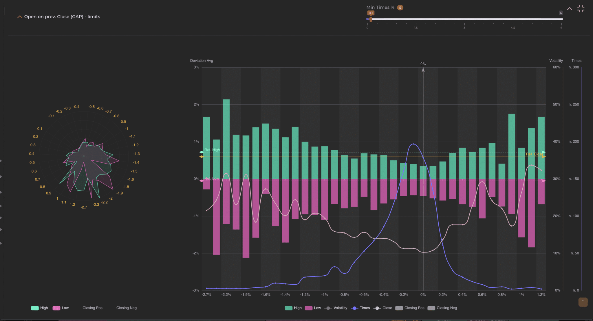
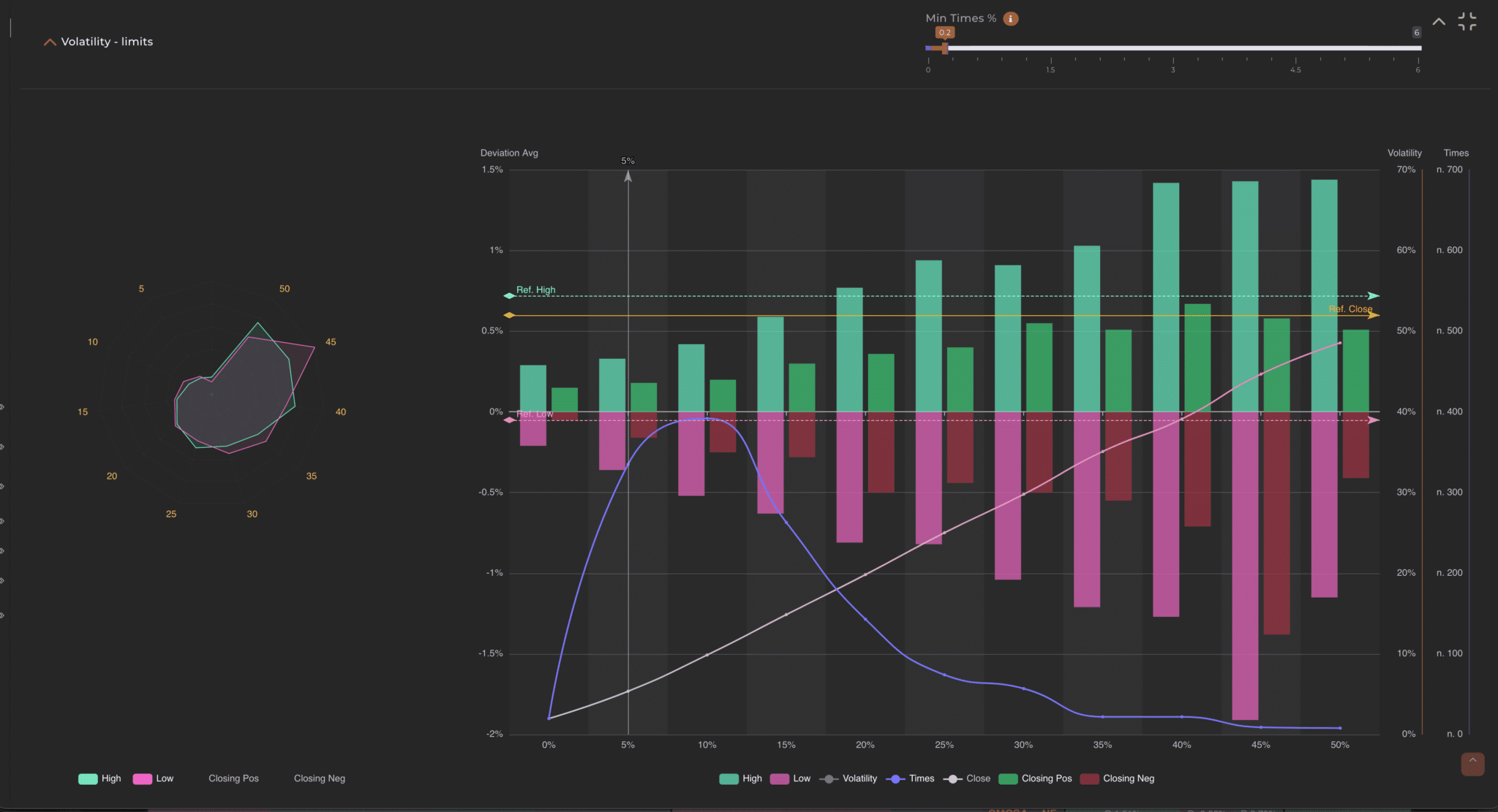
Example 1: Groupings by volatility. Consider the analysis of a security and decide to filter the entire series to observe the grouped charts, in order to obtain a comprehensive overview. Examining the chart grouped by volatility, one can notice a significant reduction in occurrences (represented by the purple line) starting from a volatility of 70%.

If the intent is to develop an effective strategy during periods of ‘normal’ volatility, that is, when volatility is not excessive, we might consider the idea of refiltering the series, excluding periods with volatility above 52%. This filter will significantly affect the calculations of the limits, as we would be excluding a substantial part of the data.

However, the new graph shows that, after applying the filter, the most significant movement is around 2%, whereas previously there were cases exceeding 4%.
As demonstrated in this example, charts grouped by volatility are extremely useful for understanding, in general terms, the type of data we are filtering. Depending on our strategy, we can choose whether to analyze the entire series, only periods with lower volatility, or exclusively those with high volatility.
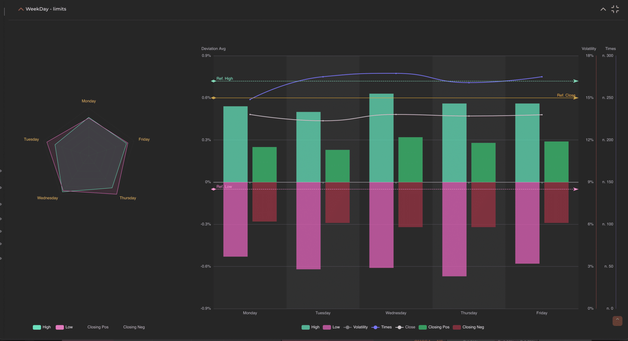
Example 2: Groupings by day of the week Imagine, for example, filtering a series to see how security historically behaves when the market opens positively in a particular month of the year. Once you filter the data set, this indicator shows you an interesting statistic in the grouping by day of the week.

Specifically, it shows you that on Thursdays the volatility is always higher and that the related limits are more affected than on other days. This type of analysis could lead you to further filter the series by eliminating Thursdays and then compare the results to make your decisions in a more informed and conscious manner.
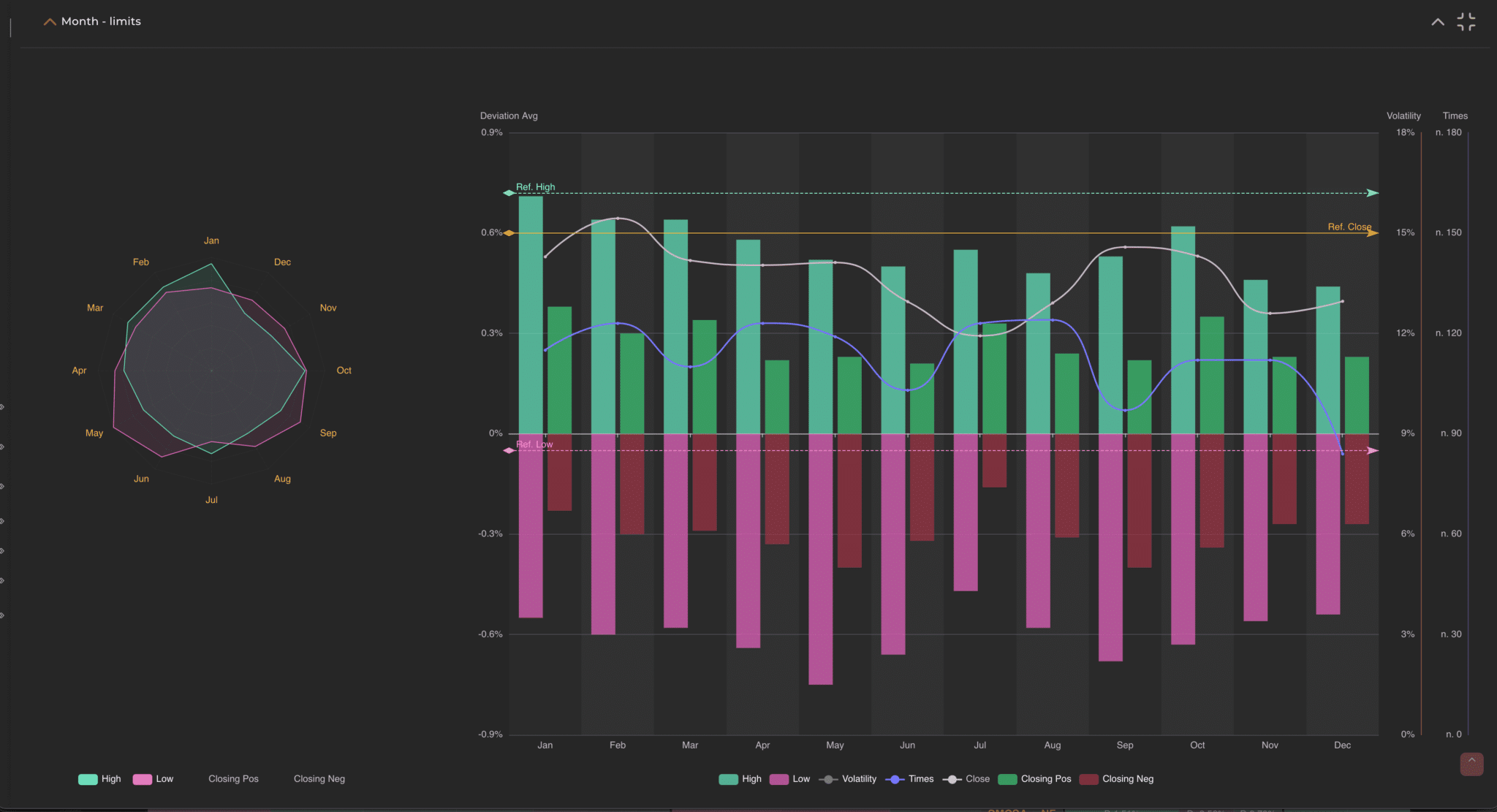
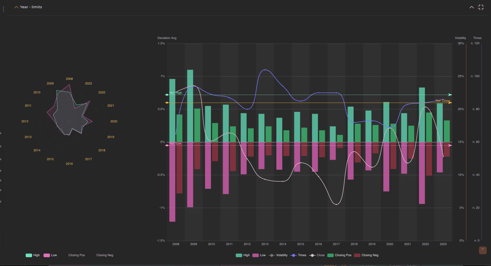
Example 3: Groupings by months Let’s consider the SPX on a monthly timeframe and filter a period of 15 years.

The image highlights that there are distinct months, such as March and October, in which the volatility is significantly higher compared to other periods of the year. This information provides us with a solid basis on which to decide which months to include or exclude for a more targeted analysis.
Suppose we consider opening a position in the month of October and notice that in this month the volatility is high compared to others. We might then choose to exclude months with lower volatility, such as February, April, June, and August, focusing exclusively on the months that exhibit behavior more similar to the period we are analyzing.
In addition, we can leverage the information provided by the graphical indicators to determine whether the market behavior on a specific day, week, or month aligns with usual standards. For example, if we are operating in November and observe that the volatility fluctuations are much higher than the historical highs/lows, we might deduce that this month deviates from the standard trends. This gives us an overview that can be further analyzed with additional filters to confirm or refute our initial observations.
This methodical and data-driven approach allows us to make more informed and strategic decisions based on the volatility and historical movements of the market.
These graphical indicators display the sum of deviations (limits) for both minimum and maximum, as well as positive and negative closings, grouped by a specific metric such as volatility, month, or opening gap. The “combined histogram” chart adds the frequency line and indicates in which metric groups the most numerous events occur and vice versa. The closing line shows us the deviation between positive and negative closings, indicating the respective trend.
Each group is represented by two similar charts, but one has additional information. The charts are “the radar”, where groupings are displayed in a circumference, and the other is the combined histogram chart that effectively combines other values useful for analysis: average volatility of the group, frequency of the group, and the difference between positive and negative closings.

Specifically, the primary metrics by which the data is grouped, each containing the two views.
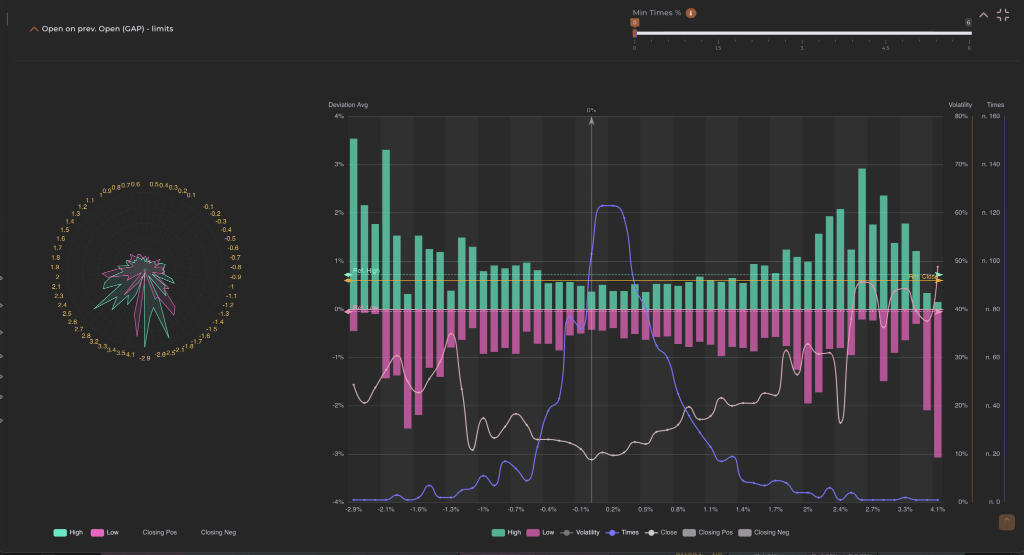
Certain groups, such as those indicating the volatility range, closing range, and opening range, offer an advanced feature that allows for filtering out ‘noise’ in the charts, namely excluding those histograms that have a frequency below a specified minimum threshold in terms of the percentage of cases. Using this function, you can customize the data display: without setting a minimum threshold (Min Times % to 0), the chart will show the entire data series. To better understand, think of the filter as a means to select occurrences. By setting the filter to 0.1%, for example, all groups whose occurrences are less than 0.1% will be omitted. If you apply a 1% filter on a set of 1000 candles, the system will exclude all groups that contain fewer than 10 cases.

Each of these analyses provides similar but slightly different information due to the distinct nature of a group (think of the volatility in % with the month “May”). Here’s in detail what these views represent: