The chart consists of a Y-axis that displays the price distance from “0” (which represents the opening of the period) and an X-axis that shows the time reference. The displayed values include the current price, historical highs and lows, as well as the highs and lows of the current period and the average closing.
The chart offers two modes: Classic and Advanced. The Advanced mode provides additional dynamic analysis functions, filtering historical periods based on their similarity to the current period. To use this mode, additional parameters such as “Time for value similarity” and “Automated similars” are required. There is also an advanced level of detail that allows you to adjust additional parameters for a more precise search.
If you wish, you can use advanced parameters such as “Value range similarity”, “Dynamic range similarity”, and “Dynamic Recover factor” to further refine your analysis.
However, it is recommended to use these options only if you have a clear understanding of their functionality.

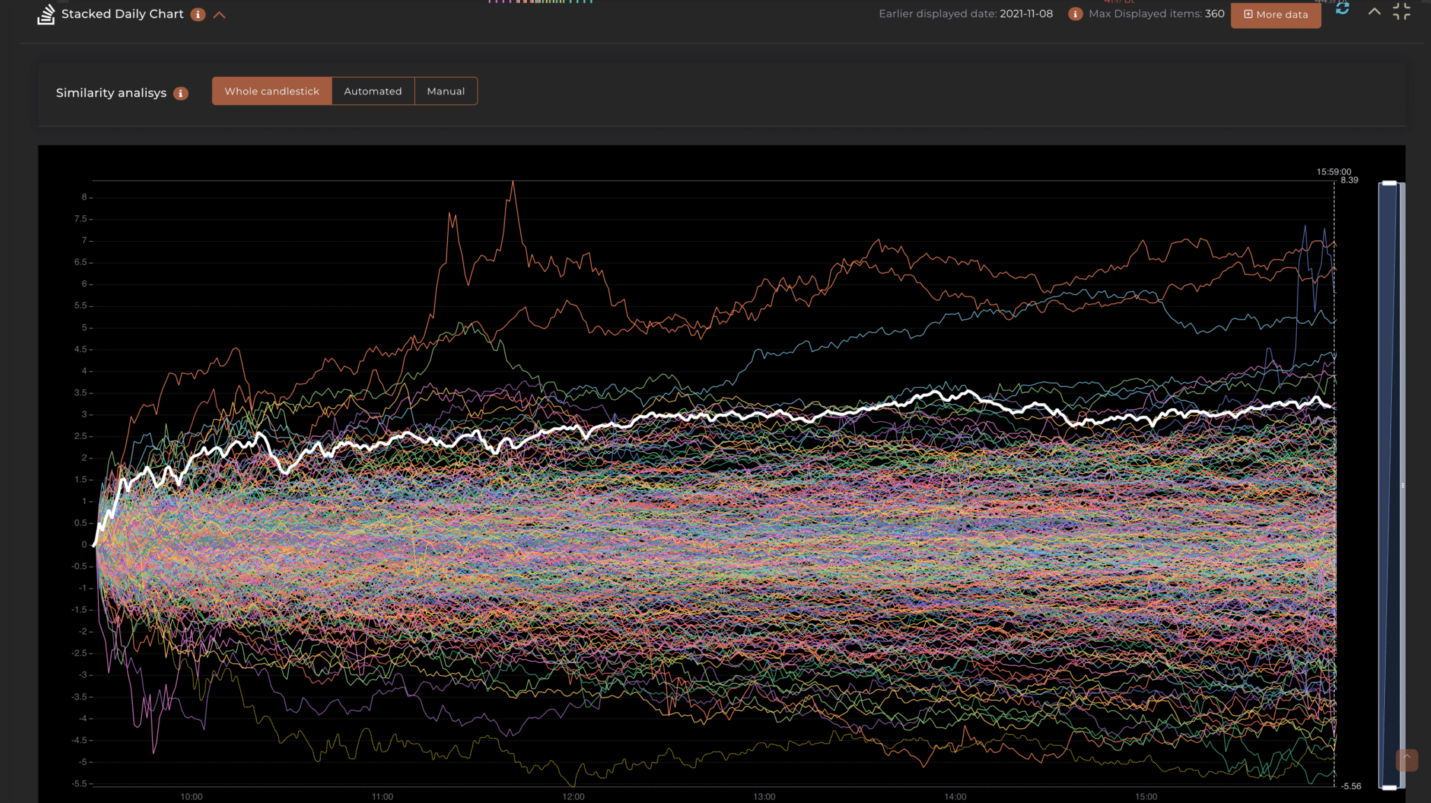
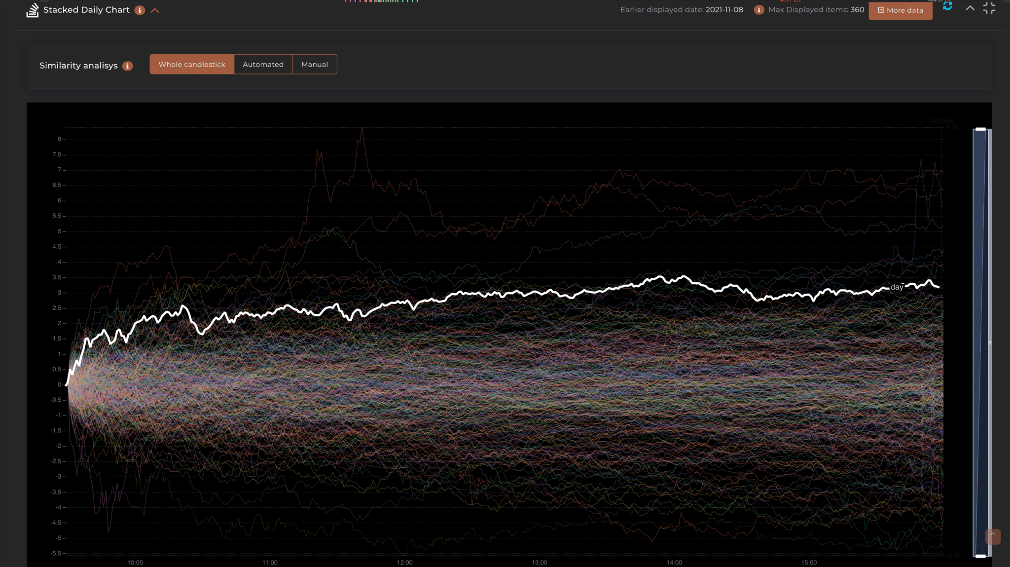
This feature displays all the historical periods resulting from the applied filter in a single overlaid chart, giving you an at-a-glance view of the historical movement range it has experienced. The black line shows the price trend in the most recent period under consideration.
On the Y-axis, we have the price distance from “0” which represents the opening of the period, while on the X-axis, we have the time reference which changes based on the time frame selected in the main filter.
The chart displays the following values:
The chart can be used in three different modes: Whole stacked (All), Automatic, or Manual. The Whole stacked version displays previous periods only based on the applied filter, while the automatic version performs additional functions.
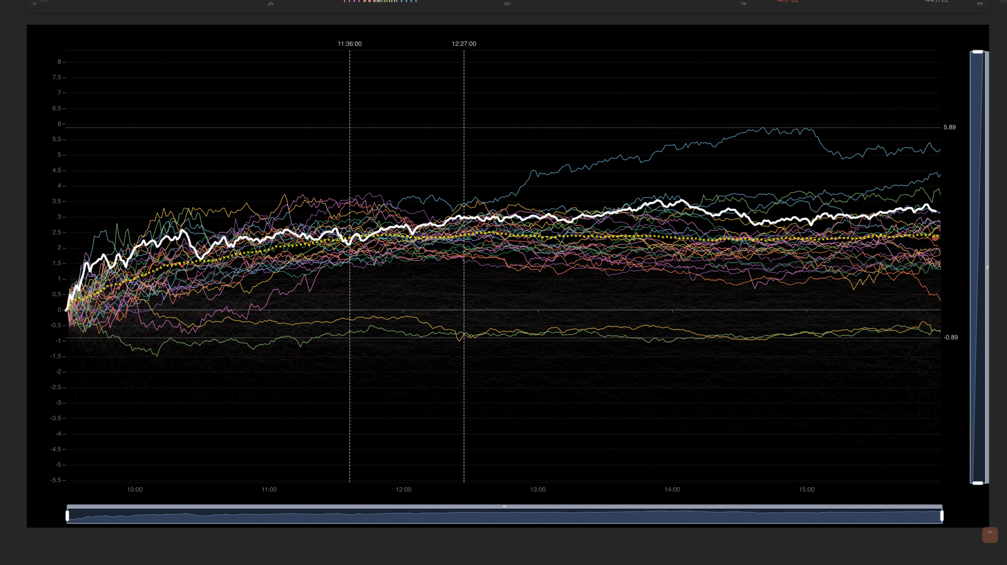
The Automatic Chart is dynamic and allows identifying which past periods behaved similarly to today. This function is capable of further filtering the periods by calculating which of them have followed a similar price trajectory. A unique analysis that allows you to put a real-time magnifying glass on data that would take years to calculate.
To enable this, you are required to enter two additional values:
A table will display the extracted similar periods.
There is an additional level of detail that we call ‘Advanced’ or ‘Manual‘ which allows further setting of some values to make the search even more precise. We invite you to use this functionality only if you have truly understood it, as the automatic mode is already efficient and correctly ‘calibrated’. However, if you decide to venture into using it, the parameters you can modify are:

Privacy Settings
This website uses cookies to improve your experience while you navigate through the website.