The limit charts show the distances (the limits) that the highs, lows, and closings of the period have reached.
Through two distinct viewing modes, it is possible to gain a clear understanding of the situation of how the current price is moving in relation to the history of similar time frames selected in the Series’ filter.
The two charts provide a precise analysis of the historical fluctuation range of the security, outlining the price limits and how frequently these have been touched.

The first chart uses horizontal lines to illustrate the price levels reached certain frequencies, painting a clear picture of the security’s behavior relative to its historical extremes.

The second chart shows the frequency with which the security has reached various price ranges, providing an instant representation of the prevailing movements. The adjacent table, marking the limits already exceeded in grey, completes the visualization, allowing for the discernment of specific trends and the estimation of the probability of extreme price movements, which helps in forming more considered trading decisions.
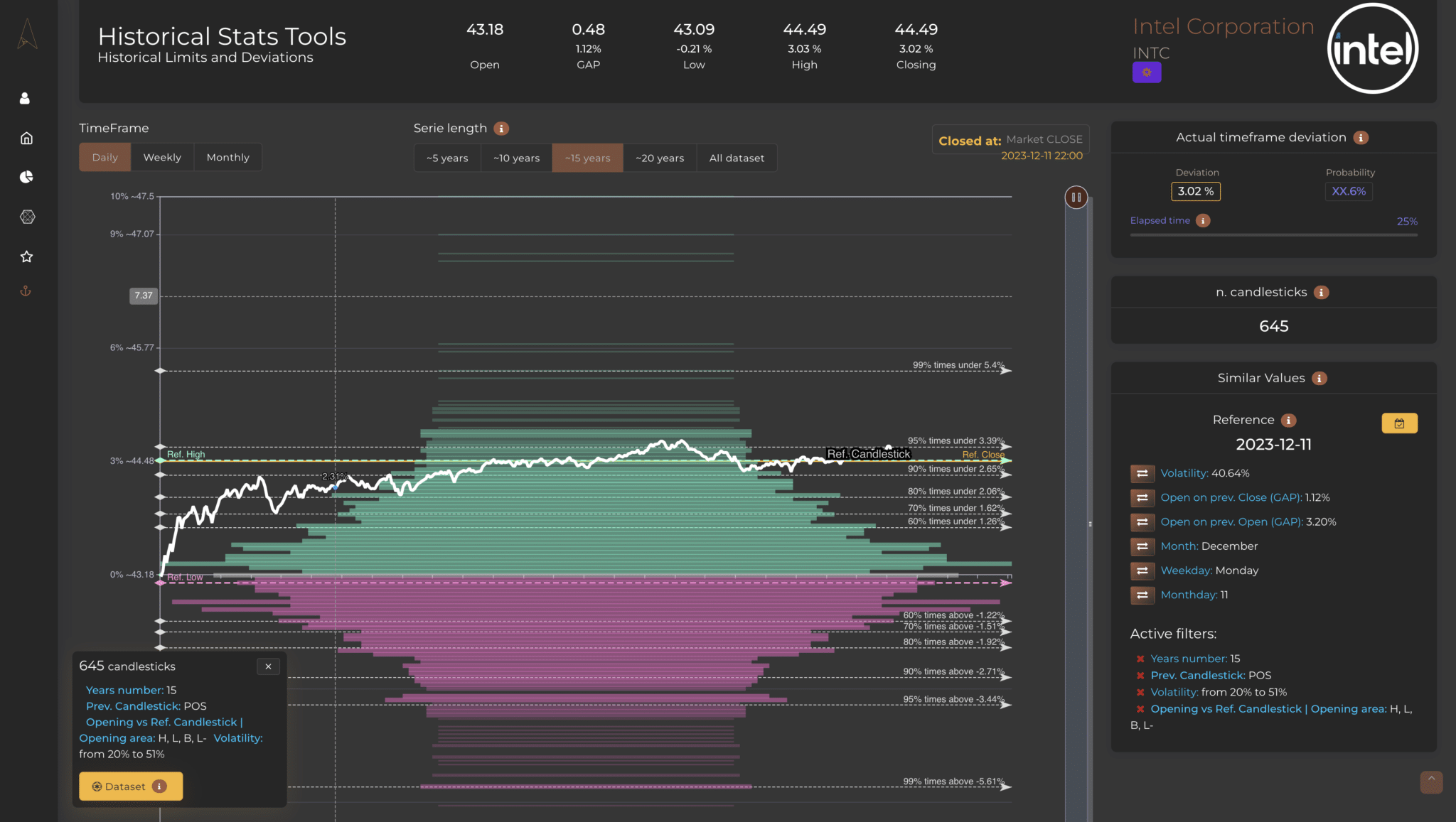
The limit charts show the distances (the limits) that the highs, lows, and closings of the period have reached. Through two distinct viewing modes, it is possible to gain a clear understanding of the situation of how the current price is moving in relation to the history of similar time frames selected in the Series’ filter.
To better understand this type of chart, it is important to start by understanding that it shows all the maximum and minimum values, or closing values, etc. (the user chooses this, but by default, it displays the maximum and minimum limits (points) of the price; Each green line is a maximum (or a positive close) and each red line is a minimum (or a negative close).
Therefore, after selecting which periods to view with the series filter, you will see its “domain” of historical movement appear on this chart and discern the main movement range of the security when conditions are as you set in the filter. A real advantage for those seeking answers on how far a price can be pushed beyond certain limits. Clearly, if you don’t apply any filter, you will see the entire series displayed, but by applying similarity filters, you may discover, for example, that there are specific days where the trend is decidedly negative when the market opens positive, or vice versa.
This first chart, on the Y-axis, highlights the historical value of the underlying compared to the current price (white line), allowing you to apply historical distances in percentage to the current value. The length of both the green and red lines varies based on the frequency with which a certain distance has been reached in the past (greater frequency implies a longer line).
On the right side of the chart, the High/Low labels represent the price levels reached by an underlying asset and the frequency with which these levels have been touched.
The levels are indicated as percentages and are clearly marked with labels such as ‘High 95% times’, ‘High 90% times’, and so on, descending down to ‘Low 95% times’. These indicators serve to visually demonstrate where the extreme price movements are positioned in the statistical distribution.
For example, if the ‘High 80% times’ level is located at 0.78% on the chart, this means that in 8 out of 10 cases, the underlying asset did not exceed that price threshold. This type of visualization is extremely useful for users because it allows for quick and easy interpretation of variance in price movements and identification of resistance or support levels that have been tested over time. Users can leverage this information to make more accurate predictions and formulate trading strategies based on the historical probability of price movements.
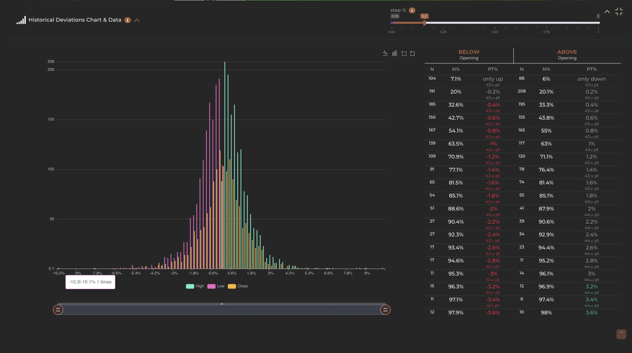
The same concept can be visualized in the following chart:
On the Y-axis, it is possible to observe the frequency with which price shifts occur, while the X-axis represents the percentage size of these historical movements.
In addition to the chart, there is a table that displays the same values as the chart but in the form of a dataset. This table shows for each direction (positive or negative) the limit in percentage, in points, and the number of times it has occurred in history (always based on the main filter applied). Finally, each limit in this table is colored gray when such a limit has already been exceeded in the current period. This is to indicate the “statistical irrelevance” of such information since it is now a surpassed limit.
In addition, at the top of the table, it is possible to modify the grouping interval using the dedicated bar. For example, a ‘Step’ of 0.2 indicates that the values are divided into ranges that go from -0.1 to +0.1, from 0.1 to 0.3, from 0.3 to 0.5, and so on, also for negative values. In practice, price bands are created, and if a value falls within one of these, it is counted in that particular interval.
For a better visualization of the intervals, it is possible to select the histograms on the chart with the mouse cursor, and a small pop-up window will be shown indicating the grouping interval and the number of cases that fall within that range.
You’ll be amazed to discover how history repeats itself and how the price often behaves more predictably than you might imagine. Knowing the limits of a specific period will make you more confident and effective in defining your trading.

Privacy Settings
This website uses cookies to improve your experience while you navigate through the website.